Known as Norway’s first “modern” church, the architecture of Kristiansund’s Kirkelandet church splits opinion. Come take a closer look.
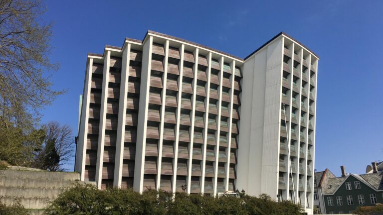
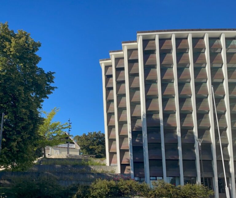
Loved by many locals and hated by some, Kirkelandet kirke often leaves tourists travelling through Kristiansund bemused. Were it not for the cross standing outside the church, most people would assume this was an office building.

Yet its controversial architecture has made Kirkelandet kirke one of Norway’s best-known churches. Not necessary best-loved, of course! Yet if you ask around in Kristiansund, many locals seem to adore it.
I have to say, I am not a fan. At all. There’s a lot of Norwegian architecture old and new that I love. This grubby concrete monstrosity is not one of them. That was my opinion when I first visited the town in 2016 and it’s still my opinion when I went back in 2022.
However! There is one saving grace. This time, I stepped inside. The interior of Kirkelandet kirke possibly saves it from being Norway’s ugliest church. Come take a look.
Interior of the church
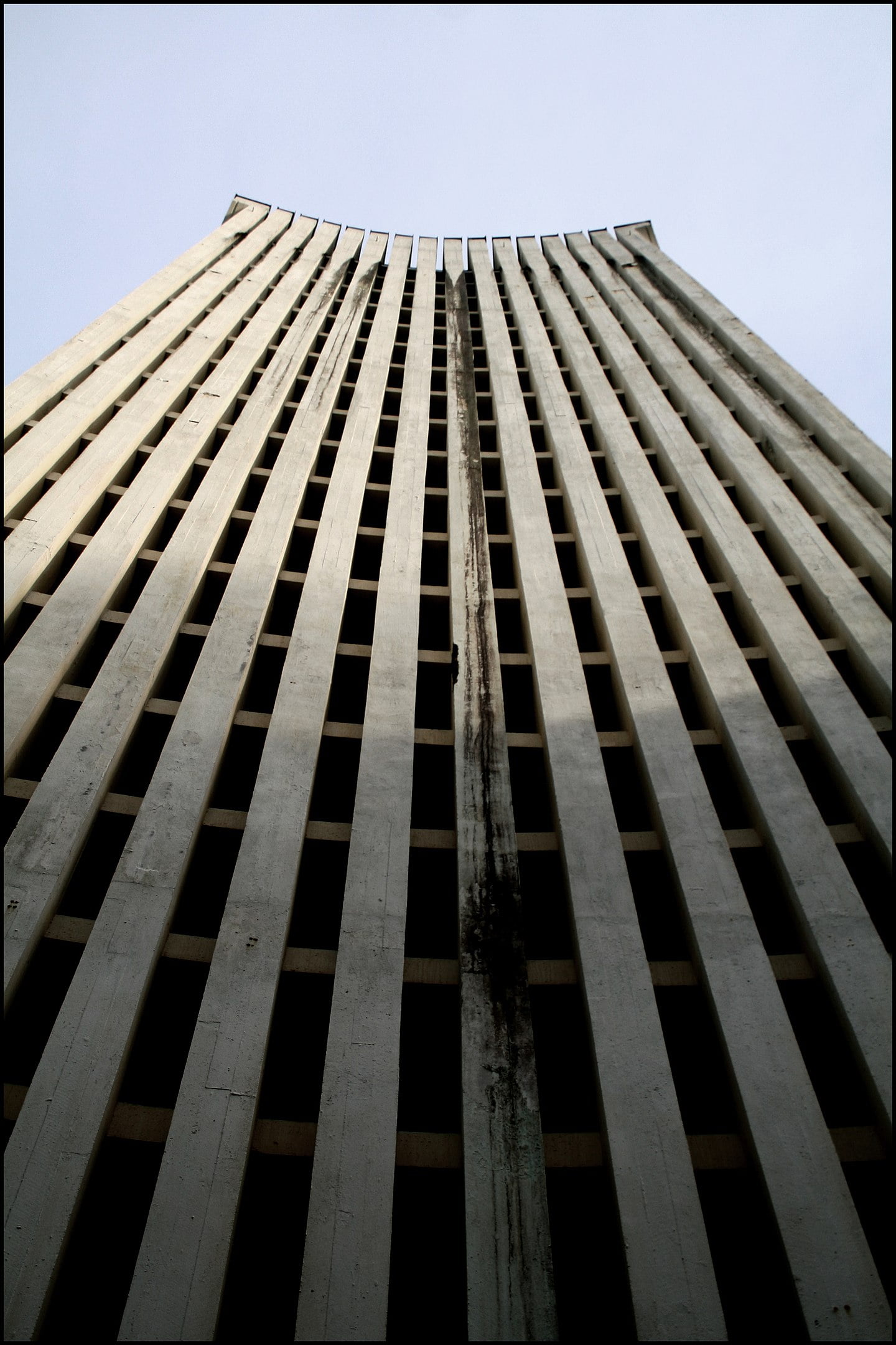
From the outside, the rear of the church actually looks even worse than the front.

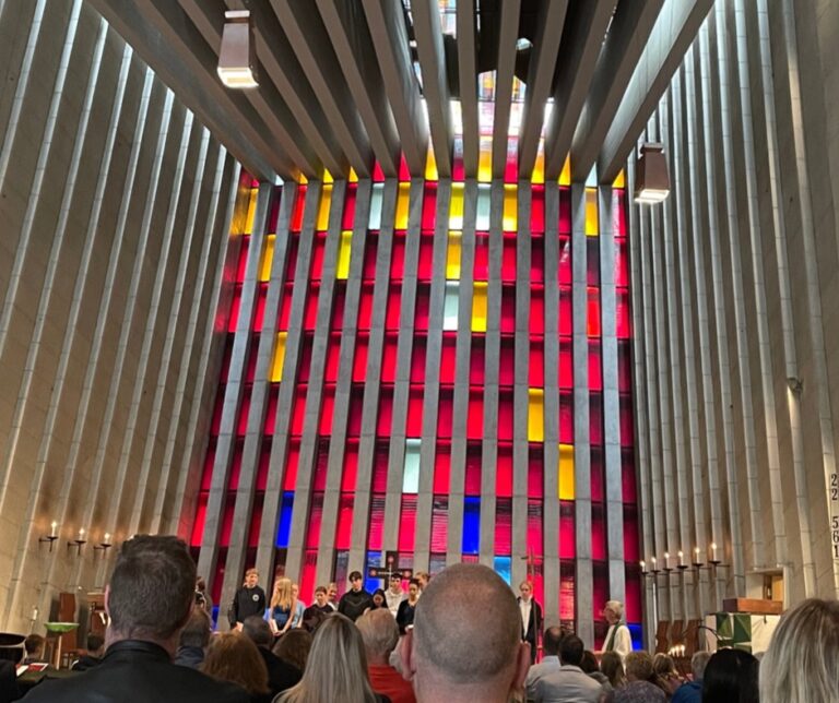
But there’s something that’s difficult to see from the outside. The back wall is actually filled with small, stained-glass windows that provide a fantastic lighting effect once you’re inside.
The 30-metre-high wall of glass panes draws attention. According to the architect, “The dark colours symbolise the life of bondage and selfishness while the lighter colours show us how God’s love changes our lives and gives man hope in the world.”

I’m not sure about that, exactly, but it certainly looks nice. The interior lights in the angled architecture at the front of the church also provide a striking welcome.
The story of the church
In 1878, a large wooden church that could seat 1,200 people was built in Kristiansund. Along with much of the town, it burned to the ground during German bombing during the early stages of World War II.
While there are other churches around the town, its replacement was built in 1964 at a cost of NOK 3 million. Designed by Odd Østby, Kirkelandet kirke was the first truly modern church in Norway, attracting much attention.

On the design, Østby said: “It was important that the entire building had strength within itself, focused around the chancel. The forces that lay within the column construction in the choir should give one the sense of forces so great that they awe man.”
He continued: “I imagined that the chancel and everything in that construction should be something that influences the congregation. And that the influence is so clear and so powerful that the individual churchgoer has it in their mind, so much so that their actions are led by it.”
The church was Møre og Romsdal’s entry in Norway’s ’Building of the Century’ competition. It didn’t win.
What do you think of Kirkelandet church? Is there beauty in the concrete? Let us know your thoughts in the comments.


Ugh as in ugly